
A lead paragraph is an introductory paragraph and can be used at the top of a page to summarise the content. Like the page title (H1), it should only be used once per page if needed.
Page introduction
The purpose of this pattern is to show all content types that can be added to article pages. Please refer to other article patterns for advised content layout specific to those patterns. Here we demonstrate a link style.
Blockquote
A blockquote is a quotation with a citation, designed to be offset from the main text on a page and is used to support content by visually highlighting a particular message or point.
Blockquotes generally feature direct quotations which may not already be mentioned in the main body of text and are placed within the reader's flow to help brake up large amounts of text.
Blockquote example
(Blockquote) A successful design system liberates the team from reinventing the wheel. It allows you to focus on what really matters
Highlight
Highlights are an excerpt of text or an article that has been pulled out and used as a visual clue to draw the eye to the text.
They are placed within the reader's content flow and are used to direct user's attention to important pieces of information.
Highlight example
Leeds is among the top 100 universities in the QS World University Rankings 2021
Accordion
The accordion component lets users show and hide sections of content on a page. Accordions hide content, so the titles need to be clear.
When to use
Use the Accordions component to make a page easier to scan when it contains information that only some users will need.
When not to use
Accordions hide content from users and not everyone will notice them or understand how they work. For this reason, do not use an accordion for content that is essential to all users.
Do not use the Accordions component for large amounts of content or for complex layouts. Consider if it's better to:
- simplify and reduce the amount of content
- split the content across multiple pages
- keep the content on a single page, separated by headings
- use a list of links to let users navigate quickly to specific sections of content
Accordion example:
Why are design systems important?
Five most recent selected publications
Lorem ipsum, dolor sit amet consectetur adipisicing elit. Doloribus saepe delectus quos quibusdam. Quos ducimus, nam consectetur ipsam illo laudantium quas, dignissimos voluptate neque est eligendi, alias et facere unde. Ex minima incidunt exercitationem mollitia ratione ut ducimus culpa nam.
Conference papers
Lorem ipsum, dolor sit amet consectetur adipisicing elit. Doloribus saepe delectus quos quibusdam. Quos ducimus, nam consectetur ipsam illo laudantium quas, dignissimos voluptate neque est eligendi, alias et facere unde. Ex minima incidunt exercitationem mollitia ratione ut ducimus culpa nam.
Journal article
Lorem ipsum, dolor sit amet consectetur adipisicing elit. Doloribus saepe delectus quos quibusdam. Quos ducimus, nam consectetur ipsam illo laudantium quas, dignissimos voluptate neque est eligendi, alias et facere unde. Ex minima incidunt exercitationem mollitia ratione ut ducimus culpa nam.
Image pair
The image pair component allows us to add images into an article. These images are not to act as links. Images have an optional caption. When only one image is available, this will span across the space for two.
The image pair component should be preceeded by a heading or paragraph content.
Two images example (with captions)

Two images example (no captions)
One image example
When only one image is provided this will be cropped to maintain a 2:1 aspect ratio (vertically centred). consideration of this should be taken when choosing the image
Further paragraph content can follow an image pair component.
Lists
Ordered (Numbered) and unordered (bulleted) lists are a great way to break up content.
When to use
Ordered list: Use an ordered list when you need to display text in some ranking, hierarchy, or series of steps.
Ordered list example
- Step one
- Step two
- Step three
Unordered list: Use unordered lists to display text in no specific order.
Un-ordered list example
- Unordered list item one
- Unordered list item two
- Unordered list item three
List items help users by:
- aiding scanning
- breaking up content into useful chunks
- drawing their eyes to the most important information
When not to use
If you need to communicate long lists of narrative text.
Tables
Tables are containers for displaying information. They allow users to quickly scan, sort, compare and take action on large amounts of data.
Large tables can be overwhelming for some people and can be confusing for users of assistive technology. Consider whether a table is really needed.
A table can often be replaced by a:
- list of bullet points with appropriate subheadings
- downloadable csv spreadsheet for large amounts of data
When not to use
Only use tables to present data and tables should never contain images in tables.
When using tables
Use a maximum of 4 columns. This is the amount that can be comfortably displayed on a smartphone.
Have more rows than columns wherever possible to make your table longer, rather than wider. This makes it easier for people to read and understand.
Table example
| Name of planet | Average temperatre | Average distance from the sun |
|---|---|---|
| Mercury | -183°C to 427°C | 57,900,00 km |
| Venus | 480°C | 108,160,000 km |
| Earth | 14°C | 149,600,000 km |
| Mars | -63°C | 227,936,640 km |
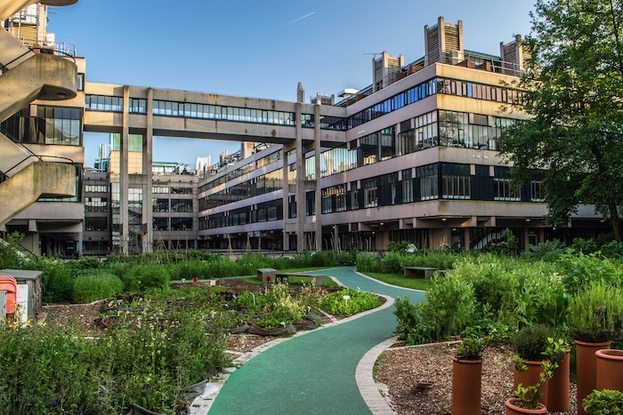
Images
Images are an important part of any web experience. They carry a huge amount of value and do more than add decoration.
They let us convey ideas much faster than text, help tell powerful stories and engage with our users in ways that few other forms of content can. Images should support each message clearly and help to deliver an engaging user experience.
Image example

Video
Videos convey ideas much faster than text, which helps us tell powerful stories and engage with our users. Some people find videos much easier to understand.
When using videos
To meet the accessibility regulations for public sector organisations, all new videos published or updated after 23 September 2020 must have this alternative content:
- an audio description
- closed captions
- a transcript
Video example
Calls to action (CTA)
We allow users to perform certain actions through the use of our call to actions (CTAs). It should always be clear to the user what the CTA's action is through text.
When using CTA's:
Try not to have multiple CTA's next to each other.
Don't overload the page with the same type of CTA or too many CTA's.
In text CTA widget title (H2)
Lorem ipsum dolor sit amet, consectetur adipiscing elit, sed do eiusmod tempor incididunt ut labore et dolore magna aliqua ut enim ad minim.
In text CTA widget title (H3)
Lorem ipsum dolor sit amet, consectetur adipiscing elit, sed do eiusmod tempor incididunt ut labore et dolore magna aliqua ut enim ad minim.
In text CTA widget title(H4)
Lorem ipsum dolor sit amet, consectetur adipiscing elit, sed do eiusmod tempor incididunt ut labore et dolore magna aliqua ut enim ad minim.
In text CTA widget title (h5)
Lorem ipsum dolor sit amet, consectetur adipiscing elit, sed do eiusmod tempor incididunt ut labore et dolore magna aliqua ut enim ad minim.
In text CTA widget title(H6)
Lorem ipsum dolor sit amet, consectetur adipiscing elit, sed do eiusmod tempor incididunt ut labore et dolore magna aliqua ut enim ad minim.
In text CTA widget title (Paragraph)
Lorem ipsum dolor sit amet, consectetur adipiscing elit, sed do eiusmod tempor incididunt ut labore et dolore magna aliqua ut enim ad minim.
Logo group
The Logo Group enables 1+ logos to be displayed in an article.
They are placed within the content and are used to showcase a logo/group of logos, such as accreditation logos.
When using the Logo Group
Upload a closely cropped logo
Add a caption
Logo group example


Two images example (no captions)
In Text Icons
In text icons introductory paragraph.
In Text facts
The In Text Facts component highlights 1-2 key facts or figures in an article.
They are placed within the content and are used to direct the user's attention to a key fact, such as a ranking or award.
When using In Text Facts
Do not reformat the text style.
Add an short headline for the title e.g. 'Top 10' and display the rest of the information underneath in the subtitle.
Variant with H2 main title and H3 items title
With link
In text facts item description
Without link
In text facts item description
Variant with H3 main title and H4 items title (default)
With link
In text facts item description
Without link
In text facts item description
Variant with H4 main title and H5 items title
With link
In text facts item description
Without link
In text facts item description
Variant with H5 main title and H6 items title
With link
In text facts item description
Without link
In text facts item description
Heading before linked list
- School of Typography
- School of Web Design
- School of Branding
- School of Fine Art History of Art and Print Illustration
- School of Media Queries
- School of Media and Communications
- School of New CSS Tricks
- School of Console Commands
- School of Front-end Development
- Institute of Accessibility for Everyone
- Institute of Content Design
Heading after linked list
Paragraph of text before the linked list. Ut enim ad minim veniam, quis nostrud exercitation ullamco laboris nisi ut aliquip ex ea commodo consequat. Duis aute irure dolor in reprehenderit in voluptate velit esse cillum dolore eu fugiat nulla pariatur. Excepteur sint occaecat cupidatat non proident, sunt in culpa qui officia deserunt mollit anim id est laborum.
Lorem ipsum dolor sit amet consectetur adipisicing elit. Iste, eligendi hic consectetur non soluta tempora expedita veritatis nam quia ab eos. Non praesentium tempore ad officia esse dolorum, nulla optio.
- School of Typography
- School of Web Design
- School of Branding
- School of Fine Art History of Art and Print Illustration
- School of Media Queries
- School of Media and Communications
- School of New CSS Tricks
- School of Console Commands
- School of Front-end Development
- Institute of Accessibility for Everyone
- Institute of Content Design